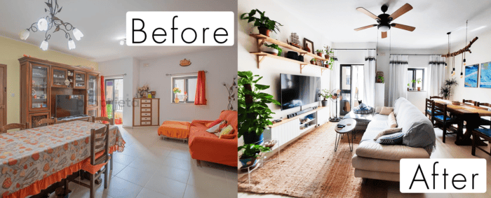
Our open space redesign
Yes, we bought an apartment and we are both super happy about it! It’s been over 7 months since we moved in and I think we changed already so many things around. Today I would like to tackle the topic as a whole – our open space redesign. Our open space has many functions: kitchen, dining, living, and one that we added, proper entryway. Let me take you on a journey about how and what we changed here!
We found our perfect apartment thanks to Antonio from Propjeta. He was a great help and took care of our apartment needs very well. It was a fun adventure as the same day when we found it, we were supposed to sign a contract for a totally different apartment. The other one was still to be finished, but someone was faster and got just a few minutes before us! Well done guys, thnx to you we found this great opportunity! The apartment was in perfect condition, just 5 years old, fully furnished, all great. It is totally not my style how it was designed, but I saw the great potential in this place.

How we redesign our open space
Before we went live with any changes in the apartment. I created some ideas in my Home ideas notebook and tried them out in an online design tool called Home by Me. It’s a nice tool and it allowed me to create content for free up to a certain limit. I think it’s perfect if you don’t need need to use it for more than 2-3 projects.
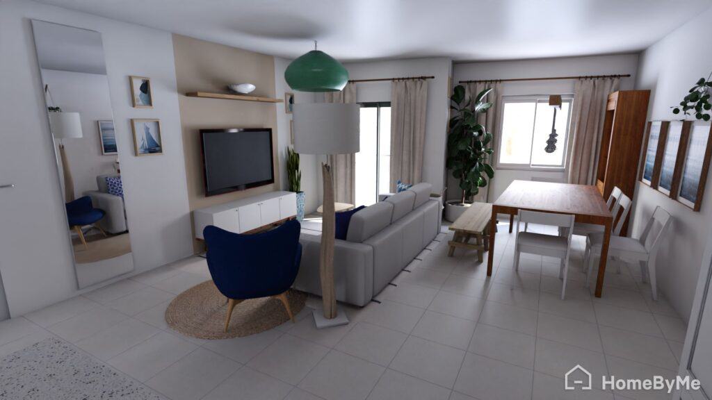
Once I had a feeling of what will work and what is a bad idea we started implementation.
Painting walls
First of all, we painted every wall off-white and remove all yellow, orange accents! We chose a paint from Beta Center in Fgura in off white colour – Snow White.


Adding extra light
The second thing is a small detail but it made a huge difference. On our windows were darkening screen stickers, and when opening the window we realised how much more light we might gain when peeling it off. I don’t mind the same stickers in our bedroom as there is a massive window and we don’t have a light struggle. In the open space in contrary. The whole point is to get as much sunlight and we can and reflect whatever gets in.
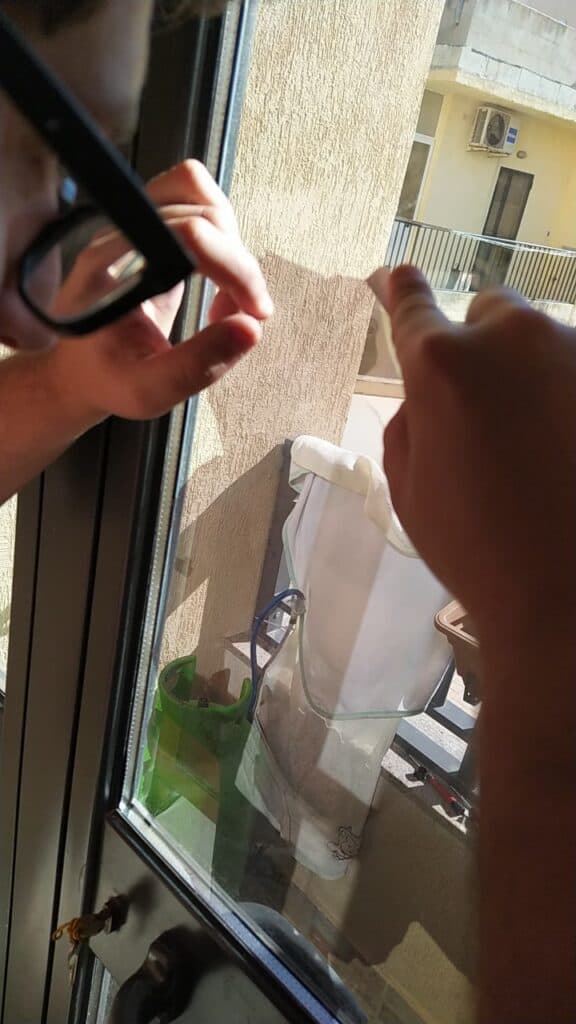
The first window was a struggle until we found out a great trick to do it. Using a hairdryer you need to warm up well the window and then starting from the edge all came out easily!
Upgrading windows treatment
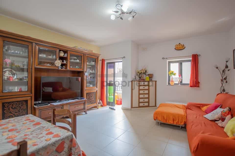
The living area felt a bit as it takes up the entire space having a sofa so far away. I knew this must change, together with windows treatment. Here is an entire post on how I upgraded my windows with DIY curtains.

Redesigning lightning
Another big change was to redesign completely lights on the ceiling. When we moved in we had only 2 ceiling lights in that space, now we have multiple kitchen counter lights + ceiling kitchen light, branch chandelier for the dining area, ceiling fan above the living room, blue pendant lamp in the entryway, and additional small side lamp next to the sofa.

Rearranging TV space
We moved the sofa closer to the wall, and to save up space and light we got rid of a big, dark wall unit and put a very simple and narrow DIY TV cupboard from Ikea. Thanks to the sofa relocation we got enough space to put the dining table in there, I love this location as now TV is perfectly visible from the table and the sofa and even the kitchen.
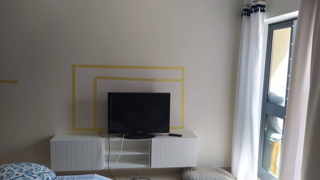

Putting nice, natural carpet (IKEA) connected living area very nicely, and in the middle, we DIY our own coffee table. Above the sofa, you can see a lamp with a ceiling fan which was a gift from my friend Bea (she didn’t want it in her new apartment) which was originally gold. The door is leading to the tiniest balcony which was as well revamped and an entire story about it you can find here.
Another two projects related to this post and visible in the picture above are DIY curtains and revamp of the Ikea cupboard.
Kitchen space
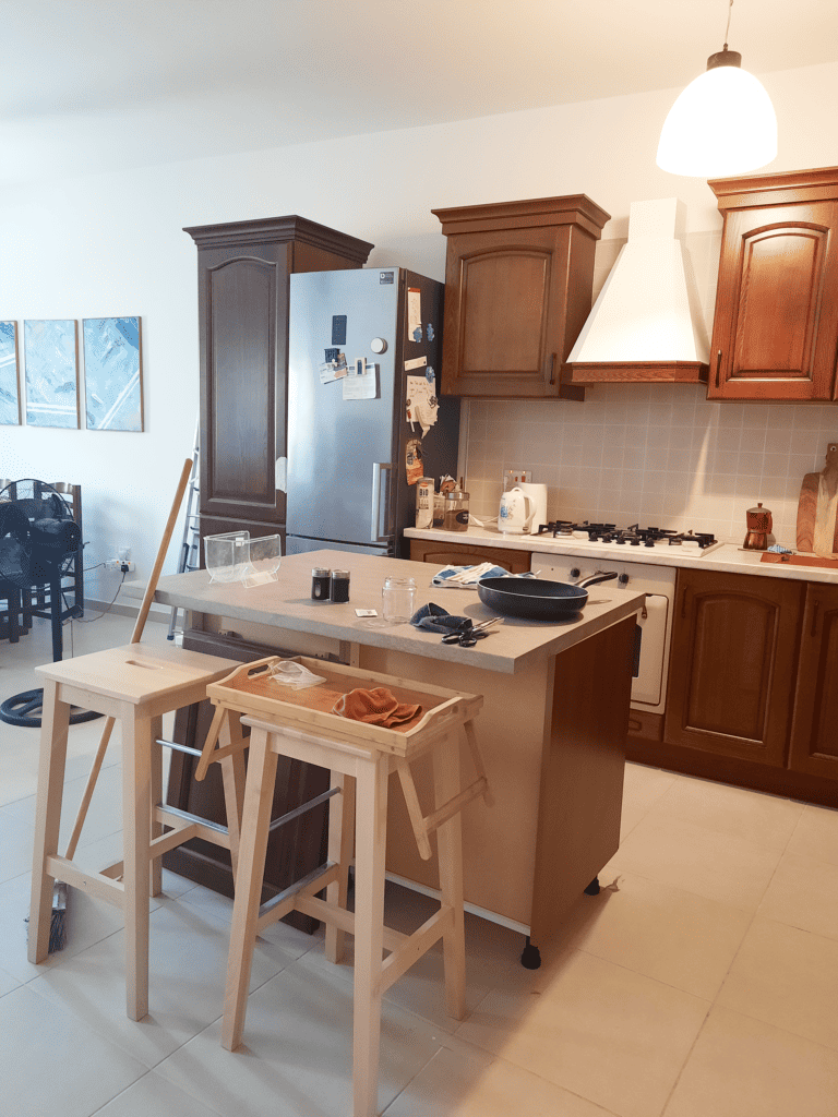
We liked that our kitchen furniture was made of solid wood. Solid wood is nice and durable. I liked as well the hob and oven, but the main issue with the kitchen was not enough space on the countertop. One of the most expensive changes to this apartment was to purchase additional furniture – as well made of solid wood. I purchased two base cupboards with drawers and one tall pantry cupboard from Mondo Convenienza from Sicily and had it shipped by Sicily Shopping to Malta.

![]()
![]()
![]()
![]()
![]()
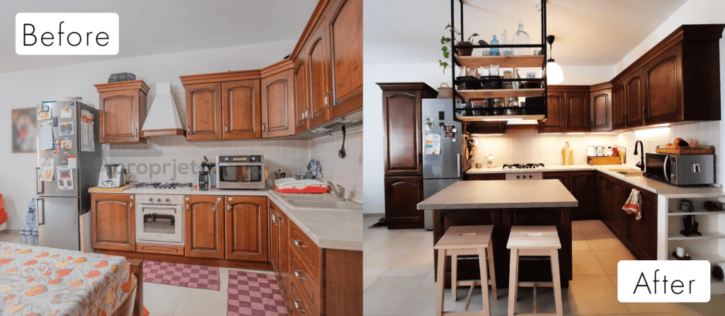
We created an island and DIY ceiling shelves above it. We changed the tap faucet for one that is more stylish but overall functional (spray function, movable and extendable head). Add countertops lights and extend the wiring for the microwave to be on the other side. We decided to build in the existing cabinet a dishwasher, which forced us to DIY some more, and I will probably write about it in a separate post! Stay tuned!
Picture “before” was taken by the agent with a different camera the real colour of the kitchen furniture is like on the picture “after”.![]()
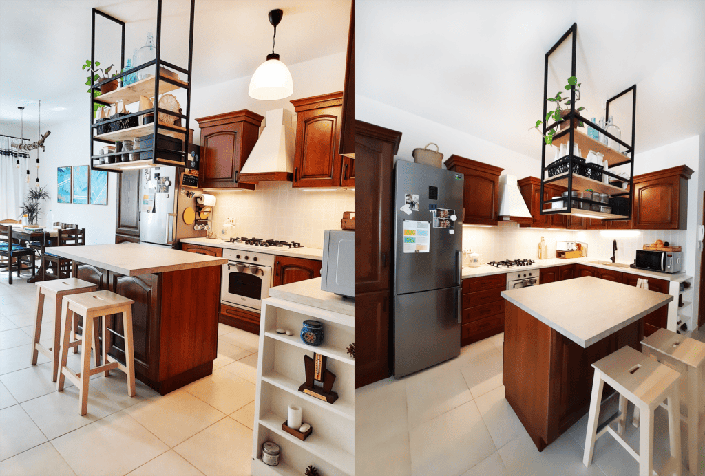
Another small but very important detail was to flip the fridge door ridges so it opens another way round, just as it should! Now opening the fridge feels so natural!
Entryway redesign
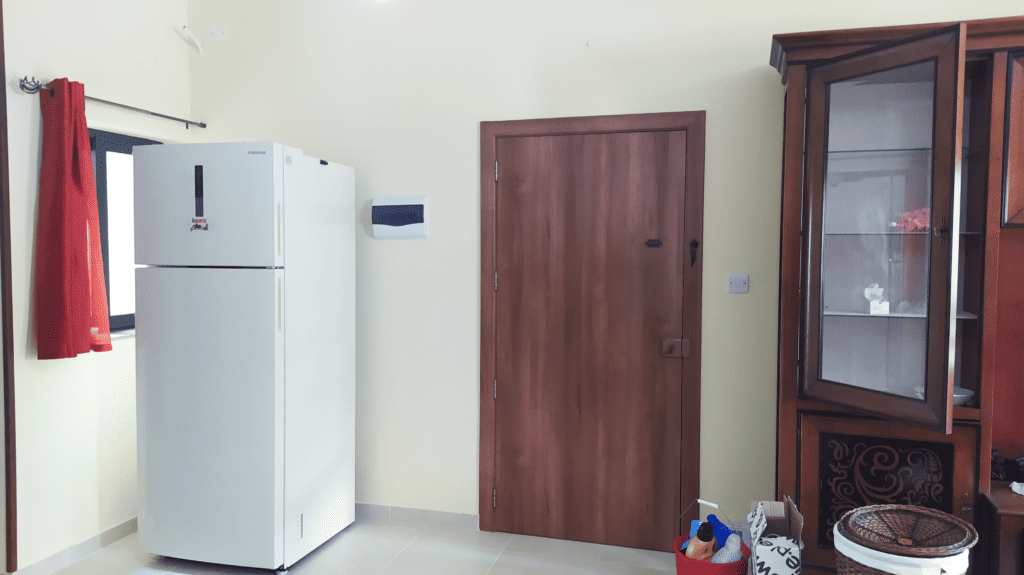
This function of that apartment didn’t exist before, but for me, it was a must. I love to have a practical entryway with some basic storage to be able to leave my shoes or jacket. I noticed that in Malta this is very uncommon, and in many apartments, you just enter immediately into the living room or the kitchen. The only thing I wish I could change is to have the main door opening another way round, but at the moment it’s above our budget and energy. What do you think about having an entryway?
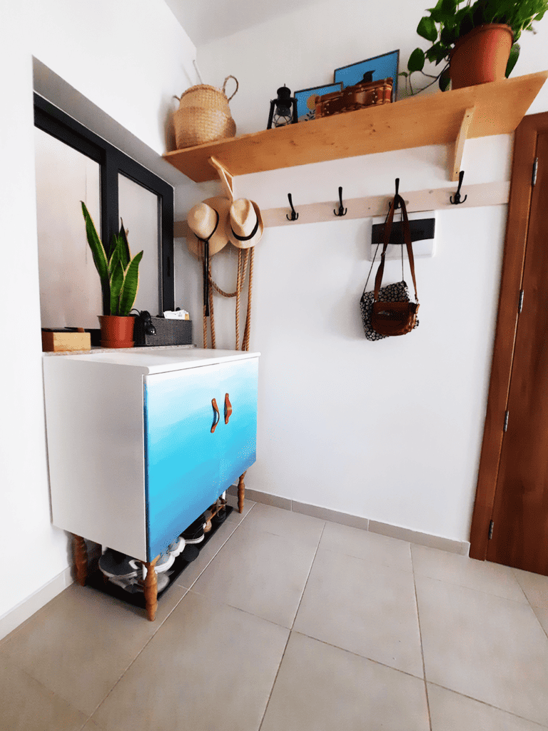
This ombre shoe cupboard was revamped as well by me, and you can find details about this furniture flip here.

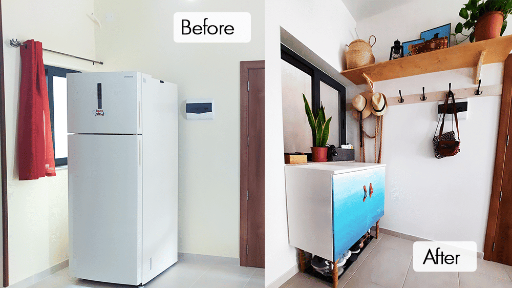

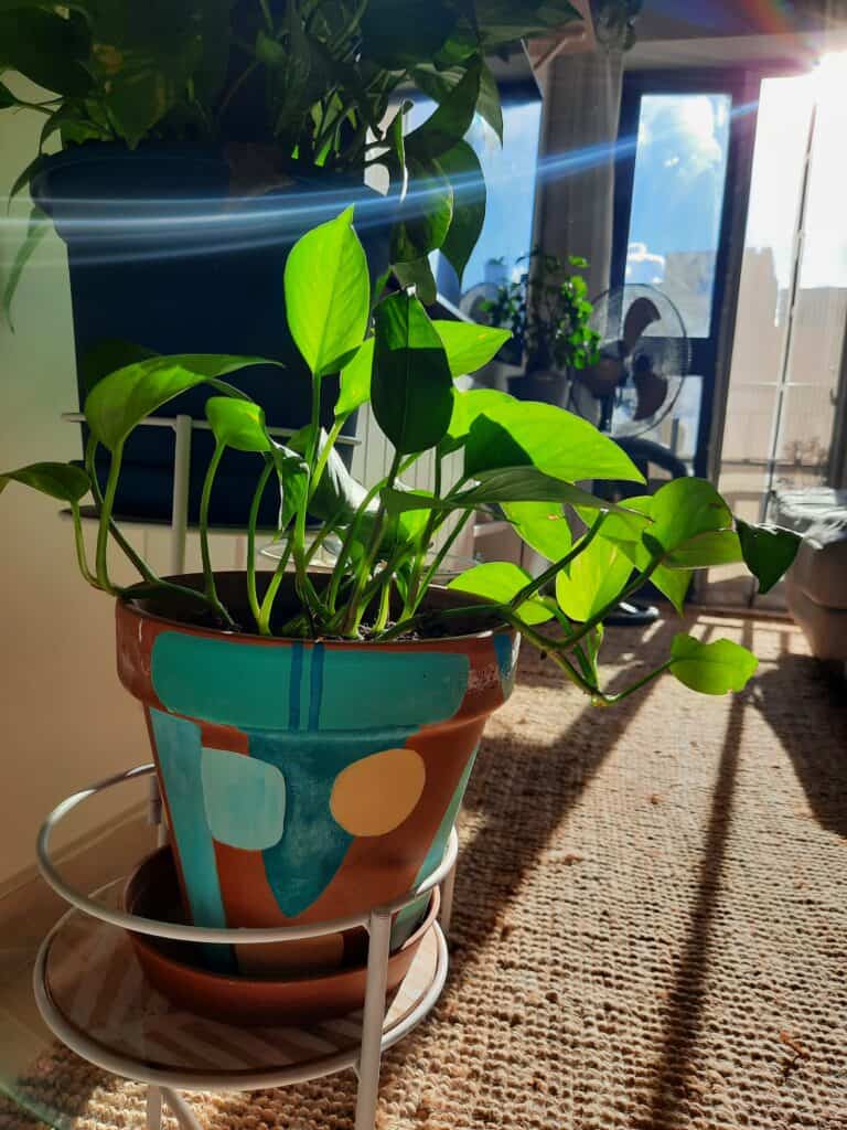
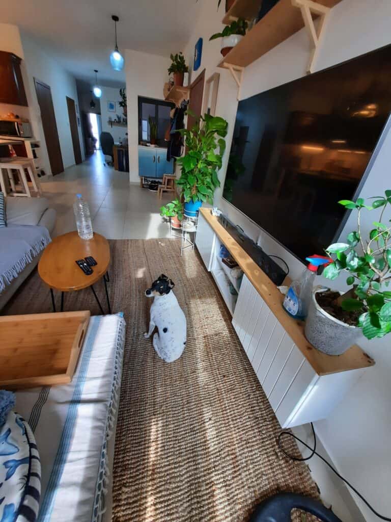
We feel super homey in that space! I love that most of these things we made ourselves! That was our way to redesign open space.
I hope you enjoyed my post! Click here to see more of my DIY!
See you next time!
